So thrilled to unveil the cover for my latest book, ILLUMINOSITY, the exciting third and final installment in the Transcender Trilogy. Once again the talented Carrie Drazek has outdone herself with this gorgeous design.
Enter the Giveaway for $50Amazon Gift Card and signed copies of the first two book in the trilogy at ENSCONCED IN LIT http://goo.gl/SdJxfq
Announcing the Upcoming Release of
ILLUMINOSITY
by Vicky Savage
May 15, 2014
Mystery, romance, and high adventure in parallel dimensions.
In this highly anticipated conclusion to the Transcender Trilogy, Jaden Beckett faces her greatest challenges to date. Her choice is clear: leave the love of her life or face certain death.
With Warrington Palace under siege, Jaden and Ryder are wrenched away from each other, as the powerful Inter-Universal Guidance Agency seeks Jaden’s ultimate demise.
Heartsick and alone, she begins a new chapter of life as a Transcender, only to discover that her fiercest battle has yet to come.
Is Jaden safe anywhere in the galaxy? Or should IUGA ask itself that question, having underestimated her before?
With her usual wit and tenacity, Jaden fights to discover her place in the multiverse, the true meaning of destiny, and the keys to the mystery of eternal love.
Choosing your book cover is not simple, but it can make all the difference in whether your book gets more than just a passing glance. It’s not as complicated as some would have you believe. Articles abound claiming to have the “Five Critical Elements” or the “Ten Keys” for making your book fly off the shelf. But after synthesizing a number of articles on the subject, it appears to boil down to three closely interrelated and overlaping qualities: (1) The Pop Factor; (2) Genre Identity; and (2) Instant Connection.
The Pop Factor: It’s not rocket science. Visualize a crowded book shelf. Does your cover stand out? Is it distinctive and eye-catching? If not, it’s likely to get overlooked. Period. This doesn’t mean you make your cover as provocative as possible. Rather, the goal is for it to be captivating and clear. There is also a more subtle piece to this distinctiveness factor–your cover must speak to your target audience. Which brings us to …
Genre Identity: Does your cover follow the current trends in your genre or category? It’s great if you want to step out a little and forge some new ground while still appealing to your target audience. But genre confusion in a cover is a killer. If your category is YA and your cover looks like space opera sci-fi, forget it. It needs to appeal to teens (or adults who like to read YA). If it’s a mystery and it looks like a romance, people browsing the mystery shelves are not likely to pick it up. Do your research. What do the current best sellers in your genre look like? Which brings us to …
Instant Connection: Call this the Three Second Rule. Experts say the average person browsing in a book store gives your book approximately three seconds before deciding whether to pick it up or move on to the next. Does your cover engage the emotions, or at least intrigue the reader enough to want to read the back cover blurb? Your cover may be distinctive and eye-catching, but if it doesn’t instantly pique the emotions of your target reader, you’ve probably missed the boat, and a potential sale!
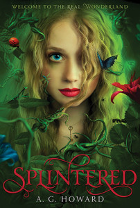
Covers that Score a Home Run: Two of my favorite YA covers (which also happen to be two of my favorite books this year) have nailed all three of these key factors: Splintered, by A.G. Howard and Cinder by Marissa Meyer:
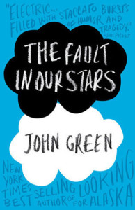
Exception to the Rules: Of course there are always exceptions to the rules. If it hadn’t been for all the pre-release hype for the wonderful The Fault in our Stars by John Green, I never would have picked up this bestselling book. The cover doesn’t speak to me at all:
What do you think is the most important element of a good book cover? What’s your favorite book cover?

